RX Global Design System
Opportunity
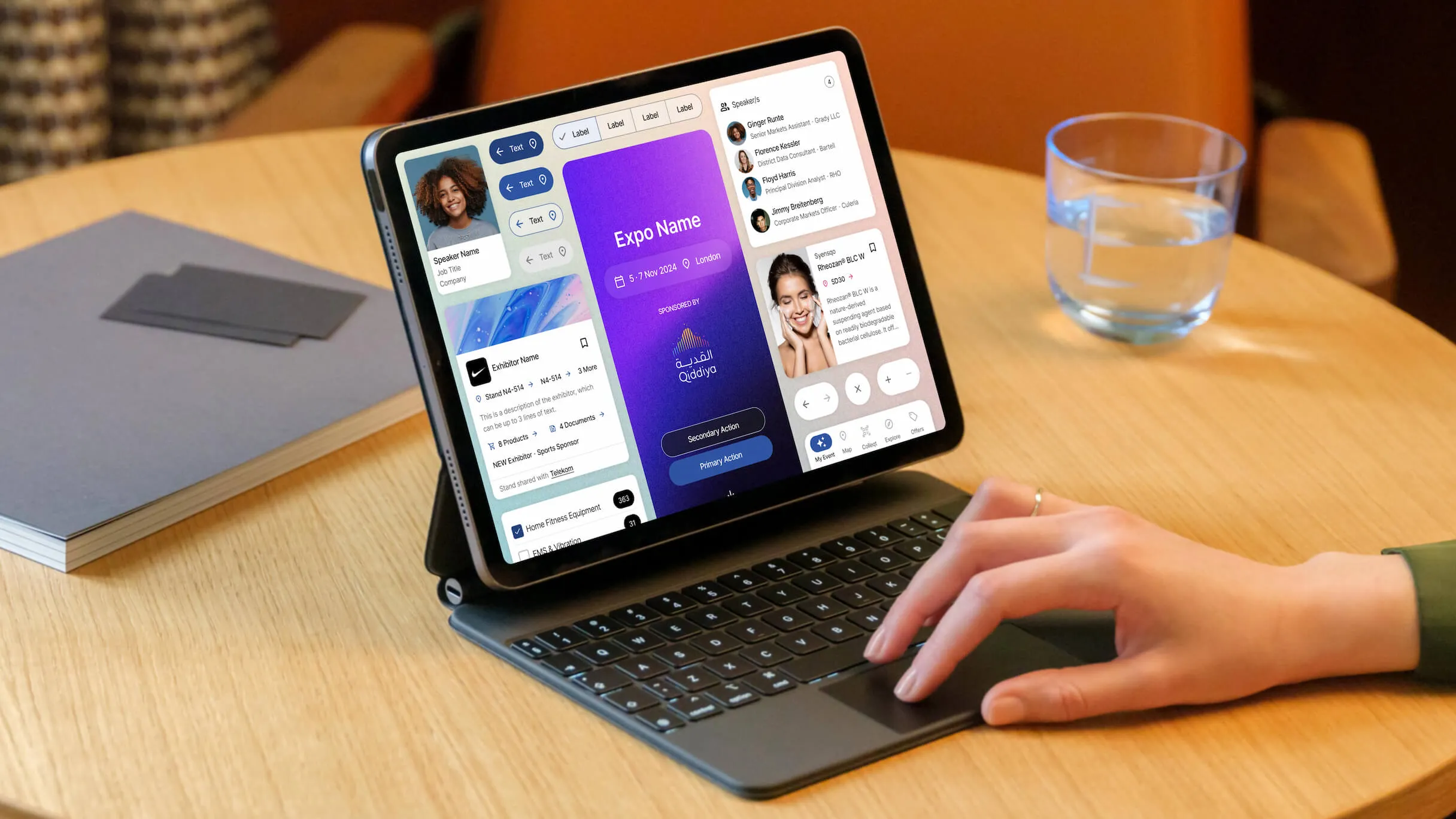
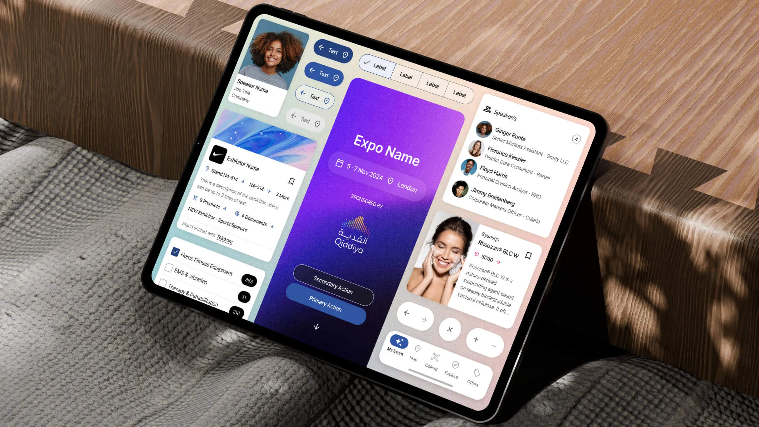
While building the ASX project, I designed a library that quickly gained traction across teams at RX.
Its modern approach and improved UX raised the bar for what the product could be, and became the foundation for RX’s company-wide Design System.
My role as Design Lead
- Led a 2 person design team (including myself)
- Process & timeline management
- Alignment with different company sections
- Adaptation of components for broader usage
- Creation of variables and design tokens
- Design documentation and maintenance
- Usability testing and iteration
- Governance and standardization
- Cross-functional collaboration with engineering, product and QA
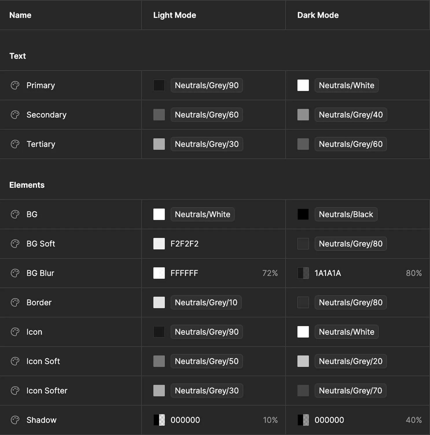
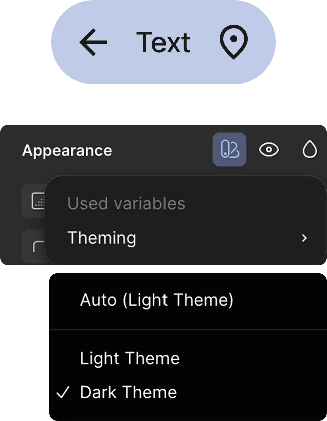
Variables setup
I started by defining the design system's core variables, including color palettes, typography scales, spacing units, and iconography guidelines.
This created a shared visual language that ensured consistency across all products and platforms.
Components construction
Each component was built to be flexible and reusable, adapting to a wide range of use cases while maintaining a cohesive design language. I worked closely with engineers to ensure components were visually refined, technically feasible, and performant.
This meant iterating based on feedback and testing until each component met the needs of both users and developers, and could be seamlessly integrated across different products. Components are built with properties for adaptability and ship with both light and dark theme support.
Component expansion
I adapted the ASX components for broader use, accounting for edge cases and varied states.
I also produced documentation to ensure consistent adoption across teams.
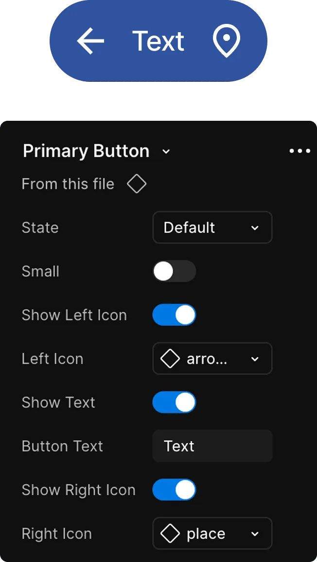
Buttons
The secondary button evolved to support both light and dark themes. Button text moved away from the expo's primary brand color to black and white, improving contrast and accessibility across surfaces.
New interaction states were also introduced — including a focus state that previously didn't exist — making the component more complete and better suited to a wider range of scenarios.

ASX button
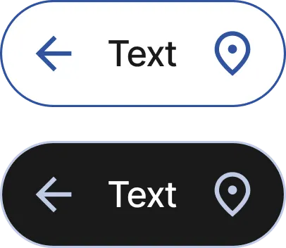
RX buttons (light/dark)
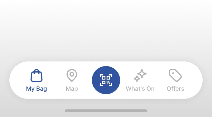
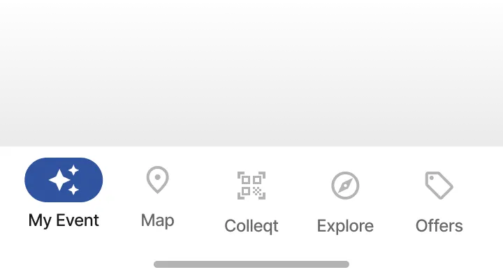
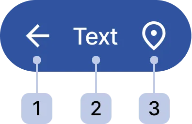
Navigation bar
Updated to Material Design 3 navigation bar, as their accessibility improved the experience and was an easier implementation for engineering.
Also migrated to Material Design icons from the previous icon library, as it was a broader library with more icons.
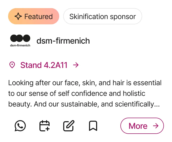
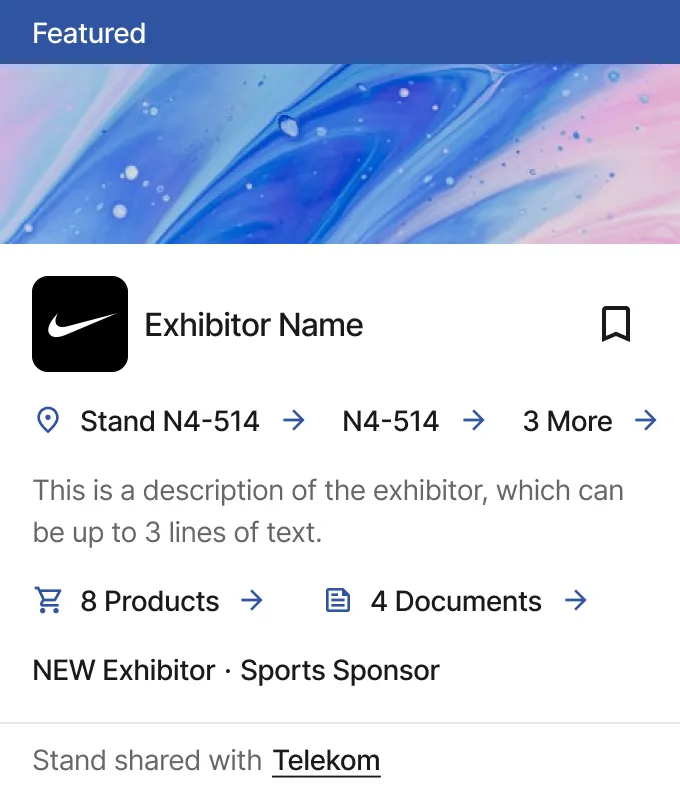
Exhibitor Card
ASX exhibitor card was focused on a specific usage: the ASX mobile app. RX exhibitor card evolved to be used in different scenarios and edge cases, like when exhibitors have multiple stands or the stand is shared.
Designs were polished, and made more accessible, Like the button text wouldn’t use the theme colour, but black text. No available features were removed.
Usability Testing
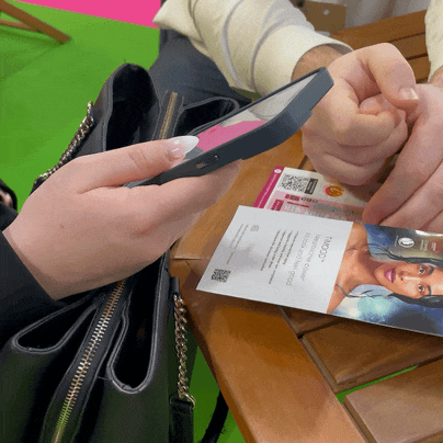
I conducted usability testing of the design system's components in real exhibition environments, observing the usage of the updated components, in different scenarios.
These sessions surfaced edge cases and interaction patterns that hadn't emerged in controlled testing, giving us actionable data to refine components and improve consistency across the system.
Key findings included information architecture considerations in components like the cards.
Files naming and structure
To keep the system scalable and easy to navigate, I established a clear file structure and naming convention in Figma.
Files were split by type: Foundation Styles and Components, each with a defined status to track progress across the team.
Files structure
Foundation Styles
- Colours
- Typography
- Spacing
- Layout grids
- Shadows (with elevation)
Components
- Buttons
- Cards
- Navigation
- Chips
- Many others
Files tasks status
- 🗒️ To Do
- 🟡 In Progress
- 🟣 Ready for Review
- 💎 Specification Added
- ✅ Done (Signed off & Spec'ed)
Everything was tracked in Jira, where we also assigned tasks.
Documentation
Documentation clarifies which components are available and approved for use, helping teams onboard quickly and ensuring consistent, correct adoption across the product.
It also improves accessibility double-checks and makes design-to-development handoffs significantly smoother. Below is the primary button taxonomy as an example.
- Icon Left ⋅ optional
- Button Label
- Icon Right ⋅ optional
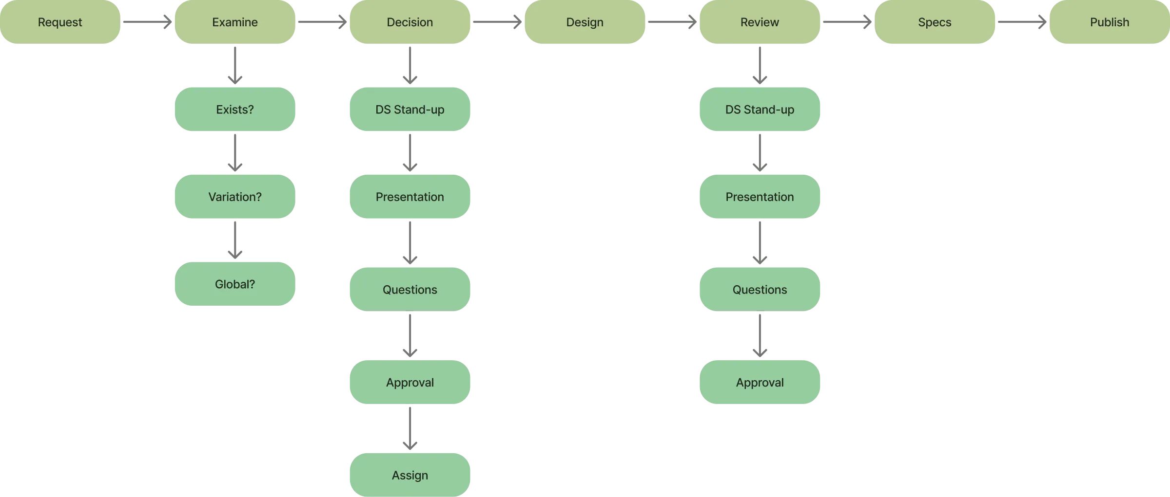
Governance
I established a governance process to ensure the design system could scale and be adopted consistently across the company.
This defined how components are proposed, reviewed, and approved, giving teams a clear path to contribute while maintaining quality and coherence across products.
Final Thoughts
Align early and often
Early alignment across design, engineering, and product is crucial. It sets shared expectations, reduces rework, and keeps the system grounded in real needs.
Prioritize adoption and stay open to iteration
They're only valuable when used, so support adoption with clear documentation, practical examples, and internal advocacy. Keep evolving components as needs, feedback, and constraints change.
Support creativity, don't suppress it
A good system provides guidance, not rigid rules. It should empower designers to solve problems creatively within a consistent framework.
Establish governance early
Without defined ownership and processes, systems stall. Clear governance ensures updates are intentional, feedback is heard, and the system scales sustainably.
Thanks for reading, want to collaborate together? Contact me here